Mutualism
Mutualism explores a reflection of queer journey and how we interpret past and present iterations of ourselves, through the lens of the symbiotic relationship between bees and flowers. The title is a biological term for the mutually valuable association between various organisms, with this work dissecting that association between our younger self who ached through adolescence, and our present self who has more growth and less questions.
In this, the bee, who works and endeavours, carries the pollen so that the flower can blossom and feed the bee. Mutualism recollects the journey and celebrates the bloom, and is a love letter to my younger self.
Playing with silhouette and reflecting on my past journey, I settled on each look encapsulating a particular aspect of the bee and flower, such as antennas or petals. Further research into fashion houses I adore, such as Schiaparelli and Vetements, as well as researching drag culture, brought me to the final looks presented: Bombus Pascuorum - representing the bee and the past - and Lavandula - representing the flower and the present.
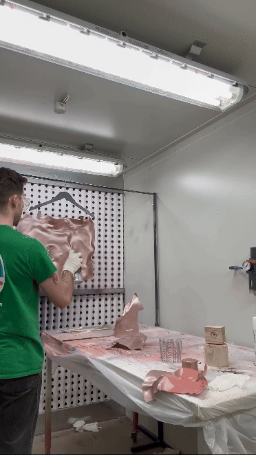
Bombus Pascuorum explores old-fashioned making techniques, such as corsetry and hand-sewing, to create a large silhouette, with dark colours and textures for a moody aesthetic. Lavandula takes on more alternative making processes such as plastic moulding, spray painting and draping. This look opposes its predecessor, it’s smaller and softer in shape, featuring soft materials across the form.


Look 1 - BOMBUS PASCUORUM
Satin ribbon and steel eyelets
Slit
opening
Invisible straps for
harness support.


Cotton Poplin
lining down to
lower hip.
Cotton Drill
underneath
draping fabric
for corset.
Rigaline boning in front/back princess seam and side seam
down to lower hip.
Double cross corset
lacing method.
Cotton/Silk
Crepe hand
sewn into
corset bodice
Heavyweight
fusing to bust
line and side
seam.
Polyester webbing for
harness support.
Mild steel exoskeleton
underneath facing
fabric and
tulle.
Technical Sketches


Mood Board

Hero Images


Look 2 - LAVANDULA
Grosgrain ribbon
to secure piece
on body.
Mix of Silk Crepe De Chine, Shimmer Organza and Holographic Organza


Plastic bodice
has been
primed and
sprap painted
with six coats.
Line opening
for ribbon
created with
multi tool.
No headband or
attachment required.
Plastic-moulded
head piece.
Technical Sketches


Mood Board

Hero Images


Fashion Context

I always want my work to be about more than the garment. Injecting history and personal narrative in my pieces feels necessary in order to give each creative endeavour meaning and reason. Alexander McQueen’s use of narrative in his collections inspire me to do the same in mine: putting personal stories at the crux of the collection and building from that.
McQueen’s It’s a Jungle Out There collection, a response to the criticism and controversy the designer received in the industry at the height of his popularity, is an example of his personal life fueling the foundation of the work.

As a queer designer, I want that narrative to centre around the queer experience - coming out, chosen family, coming of age, growing up - and the history that comes with being queer - LGBTQ+ rights movement, Stonewall, Pride, protest, marriage equality. I want my own experience and opinions to show in my work, allowing the chronological growth of my work to be noticeable as the viewpoints of my collections shift over time.
One of my favourite queer designers, apart from Alexander McQueen, is Thierry Mugler. His balance of high fashion haute couture and costume, and his diverse range of models in his shows, stand as a major source of inspiration. The silhouettes are big, the designs are camp and extraordinary, the shows are fantastical. It’s these factors, as well as the legacy he still has to this day, even after his death, that bring me joy and inspiration in my fashion.
Alexander McQueen
My love for drag culture and its history in queer culture, as well as Mugler’s application of drag in his work, always shows in my fashion. The influence of drag in the cultural zeitgeist should not go overlooked. Its domination in film, TV and high fashion, and subsequent commodification, brings it a greater relevance to fashion making, thus bringing a stronger context to my fashion’s social and marketable relevance.
I love drag for its subversion of gender, its larger-than-life status, its history in activism, as well as the alternative and low-brow approach to making garmentry. The beginnings of drag came from ballroom culture, born in New York by the African American and Latino LGBTQ+ community, and its mainstream appeal has made it a more commercial expression of fashion.
Thierry Mugler
.jpg)
Miss Fame
Initial Ideation
%203.jpeg)
My ideation started with sketching out some simple shapes to gain a silhouette.
Already, you can see a collar, a mermaid tail, a sleeve, being created by placing various shapes together. I knew I wanted to have big silhouettes and narrative in my work. These shapes were inspiring me on what the final product could look like.
Alexander McQueen’s dissection of opposing narratives such as good and evil brought to me the idea of having these two looks speak to each other, having a dichotomy.
I thought of classic oppositions within literature: day and night, ying and yang, angels and demons, life and death. However, I wanted to express something that wasn’t opposed to one another and had a more meaningful connection to each other. This got me thinking about a phoenix and ashes, flower and soil, sock and shoe, Lennon and McCartney, flower and bee: entities whose relationships were not so simple, but rather had a dependency on each other.
The flower and bee motif struck me as it got me thinking on their dependent relationship: the flower provides nutrients to the bee through nectar and pollen, while the bee pollinates and disperses the flower’s seed so that it can reproduce. It is a symbiotic relationship.
%202.jpeg)

Ideas of flowers and blossoming connected to me as I am currently experiencing my own
blossoming in many ways, as a young adult and a queer man. With an interest in queer
journey and self-reflective narrative in my fashion work, it felt like a lightning bolt to make this connection between the flower/ bee motif and its relevance to my queer
journey.
This motif feels more correct since my very first tattoo was of a flower and a bee. The meaning of this tattoo is special to me. When I was 18, I was eager to donate blood as it was something my whole family did. Upon realising I could not donate blood as Lifeblood does not allow blood donations from sexually active gay men, bisexual men, transgender women and some non-
binary people who have sex with men, even if they are in a long-term relationship, due to possible exposure to HIV, I felt ashamed and unwanted by an outdated institution.
In retaliation, I got the tattoo, having previously stopped myself from doing so so that I could donate first. At the time, I was outraged, but also confused as to why I was feeling outraged. To centre my work for this project around a flower and bee, it feels like a full circle moment, a message to my younger self that the Velvet Rage of my adolescence has now evolved into queer joy and the beautiful work I have created for this assessment.
Set on the flower and bee idea, I wanted there to be a dichotomy in certain elements of the pieces. The bee has a hard, rigid shape while the flower is more soft and buoyant. Furthermore, I am eager to show multiple components of my fashion talents, so the ‘bee’ piece has a major focus on pattern
making and hand sewing techniques, while the ‘flower’ piece is more focused on alternative making practices, which are explored further on the next page.
Design Proposals
%203.jpeg)
Design #1 encapsulates the physical shape of a
flower’s petals through a large backpiece as well as the bodice and skirt of the design. A fitted taffeta skirt sits underneath a steele-boned corset. Featured too is a circular headpiece made from metal welding.
Although a nice design, I was eager to make the bee/flower motif more subtle, which this design was not - it felt pretty obvious the garment was striving to emulate a flower’s anatomy.
In Design #2, a form-fitting velvet gown covers the model’s head (beside a face cut-out) and hands to make a glove. Over the gown is a structured body piece designed to look as if it is floating above the model, wrapping around the torso and falling behind to make a train. This design takes reference from Vetements SS24 and Schiaparelli FW19. The fur of the velvet is to emulate the skin of a bee, the bodypiece its wings.
While one of my favourite designs proposed here, I felt the design would be too similar to previous works I’ve done, and was eager to tread new ground.
%202.jpeg)
%203.jpeg)
Here is Design #3, expressing the microscopic
anatomy of a flower. It is more extra-terrestial, with 3D-printed skeletal structures as a headpiece, bodypiece on the bust and ‘antennas’ sprouting from the hands and bust.
Although I like the headpiece and hand antennas, the skirt’s design felt too light and ballerina-like for this design. I could have reconfigured the skirt design to fit the prompt better, but I ended up going in a different direction.
Design #4 features a bodice corset with fabric
draped and hand-sewn into it. Attached on the back is a backpiece made from the draping fabric, inspired from Schiaparelli FW21. A 3D-printed eyewear piece is designed to emulate a bee, inspired by Thierry Mugler eyewear.
This design posed a new challenge for me as a designer and had the fashion references that I connected with most when designing this collection. Thus, it will be Look 1 for this submission.

Design #5 focuses on plastic moulding to create the bodice and headpiece, and fabric draping to create the skirt. This design takes the goal of Design #1 - visualing the petals of a flower - and brings a more abstract approach, contorting the petals shapes to make the form of the bodice and headpiece.
It’s a new take for me. Designs #1-4 look rely on fabric to create the major components of their respective look, this design aims for a more alternate approach. For these reasons, this design moved forward in the process.
